Money Box explains rules for working from home tax relief
We use your sign-up to provide content in ways you’ve consented to and to improve our understanding of you. This may include adverts from us and 3rd parties based on our understanding. You can unsubscribe at any time. More info
Artist Pablo Picasso once remarked: “Colors, like features, follow the changes of the emotions.” It’s a rule that many interior designers echo, making mood the deciding factor of colour schemes throughout the home. But matching the right colour scheme with the mood can be tricky to decipher, and one wrong tone can evoke the complete opposite effect than intended.
One of Pinterest’s top predicted trends for 2022 is the rise of ‘emotional escape rooms’’ – from rage rooms, libraries, yoga rooms to music studios.
However, it’s hard to get the most out of these designated rooms with adverse colour schemes. The wrong colour scheme can even go as far as impacting performance, making it an important consideration when planning study or workout rooms.
Abstract artist and colour specialist Furrah Syed told Express.co.uk: “Each room has a specific function whether it is in our home, place of work, education space or even a spa setting.
“Choosing the right colours in the interiors significantly enhances the effectiveness of the room and heightens the response of the person in that environment on a physical, emotional and mental level.

If you want a room to relax in:
In the last three months, Google searches for ‘meditation room’ and ‘massage room’ have increased 49 percent and 23 percent respectively.
To curate a good room to relax in, try to surround yourself with calming colours to help destress, meditate, or just switch off. To do this, go for colours like china blue or mint green.
Ms Syed said: “Avoid bright, bold colours such as reds and oranges when furnishing your room, as they will excite your senses. Instead, use shades of cream and beige to create a calming contrast.”
If you want a room to get creative in:
Google searches for ‘art studio at home’ and ‘guitar room’ have increased this year by 50 percent and 91 percent respectively.

To feel more inspired in your surroundings, contrary to the relaxation room; good colours to choose from include the more bright, bold tones of orange, yellow, purple or red.
Ms Syed said: “These colours are known to spark imagination and can evoke feelings of optimism and energy.”
However, try not to use all four colours at once, as Ms Syed warns this can be overwhelming. She said: “A carefully curated mix of two of these colours will entice your creative energies and allow your inner visionary to come alive.
“These shades have a high frequency of energy vibrations, meaning that your mood will become uplifted and help you to spark ideas.”
If you want a room to let off steam in:
The search for ‘rage room’ has increased in Google searches by a staggering 311 percent in the last year.
DON’T MISS:
Burglar warning – video doorbells could INCREASE chance of attack [INSIGHT]
The best plants to propagate in your home and garden right now [ANALYSIS]
Upcycling hacks to ‘instantly breathe new life’ into your garden [EXPLAINED]

Rage rooms, also known as smash or anger rooms, are areas people use to let off steam and vent their ‘rage’ by destroying objects.
Ms Syed said: “While the immediate satisfaction can be temporary, a dedicated ‘rage room’ space can help to calm you, alleviate nerves and see things more clearly.
“Go for shades of red when decorating it, as this colour has the highest frequency of energy vibrations, and you can physically feel the heat that red exudes.
“It thrills us as well, which is why most theatres have red interiors to get their audiences excited – red will help to keep your energy on a high for longer.
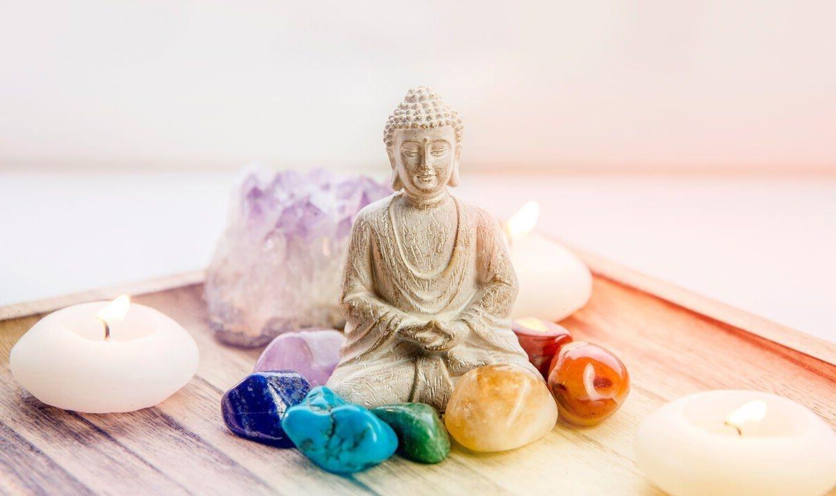
If you want a room to feel zen in:
Crystals and dedicated rooms for spirituality have also seen a boom over the past year.
For some, crystals can be a helpful tool for stress relief and reconnecting with ourselves when feeling overwhelmed.

Ms Syed said: “Go for earthy shades to create your own peaceful oasis. Shades like beige, oak, charcoal and burnt orange can imitate nature at its calmest state.
“To accompany these tones, go for hints of dusty rose, olive greens and sea blue in some of your upholstery and cushions to add a touch of tranquillity and serenity.”
If you want a room to work out in:
Perhaps pandemic-influenced, perhaps not, but search results for ‘home gym’ and ‘home gym equipment has increased 50 percent in the last month. And, for an activity that requires a good level of motivation to see through, a well-designed room will push you halfway there.
My Syed said: “Choose either red or orange – but not both, as these shades can raise our blood pressure and stimulate stamina.
“Blend this with small drops of ocean blue, soft green and whites to increase your focus.”
Ms Syed continued: “Elements of yellow can really help, too, as it has the ability to increase focus and motivate anyone who is working out in this environment.
“However, avoid pink in your gym as it can drain your energy. In fact, some sports teams even go to the extreme of painting the opposing team’s lockers pink to reduce their aggression.”
If you want a room to study in:
Similar to the workout room, a study room colour scheme needs to promote stimulation and motivational properties, but with more of a tranquil balance.
Ms Syed said: “You should decorate your home library with shades of red, as it’s the quickest colour read by our brain, helping to stimulate our energy and focus.
“Shades such as pistachio green can complement the red, improving our vision, focus, and providing a sense of balance.
“However, be wary of colour overload – too many shades can be distracting. Where necessary, add furniture with calming colours such as cream and beige.
“And avoid pointed edges on furniture – softer edges have been found to keep us focused and reduce stress.”
Anne Marie Britton, group sales and marketing director at Miller Homes, said: “As our spare rooms extend beyond simply having guests stay over, more and more people are looking for creative ways to use this extra space.
“We live in a busy world, and we all need our own safe place to go when we feel overwhelmed, need to focus or perhaps just decompress.
“By using Furrah’s suggested colour palettes, you can tailor a space to meet your emotional needs without having the hassle of leaving your home.”
Source: Read Full Article